
That being said I present to you a piece of popular Kabbalah. German artist Josua Reichert does a lot of work with alphabets. For example he produced an alphabet book that is the smallest in the world. What I have here is his Otiot book on the Hebrew alphabet.

Reichert offers a truly eye-opening way of visualizing Hebrew letters.

In my father's dream synagogue, the one he builds with his Reform rabbi friend when they both get tossed out of their respective movements, there are going to be a pair of floor to ceiling length lava lamps. I figure Reichert's letters might work well in this setting.
In addition to the letters, Reichert matches his prints with quotations from the Zohar on the meaning of these letters.
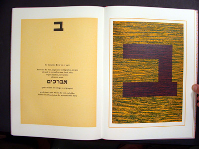
I have to hand it to Reichert; unlike most people trying to make use of Kabbalah, Reichert actually seems to understand what he is working with. In attempting to create kabbalistic art, he chose the medium of letters as opposed to visual images. This brilliantly captures one of the central dilemmas of kabbalistic thought; how does one visualize God, who is, by definition, beyond all images? (See Elliot R. Wolfson, Through a Speculum that Shines.) One of Kabbalah's solutions has been to focus on the Bible itself and particular the Hebrew letters within it as manifestations of the divine.
2 comments:
Wow. I admit that this aleph seems very diffrent from the way i've always seen it. it looks almost like a muscle-bound hero, gesturing towards the heavens. on the other hand, the beis beneath it seems pretty straightforward. Can you show any other striking letters?
If you give me an email address I could send some more pictures.
Post a Comment